Rankings You Never Asked For: Uniforms
Uniform information via Uniform Lineup
Images are not my own. Credited below.
Lately, professional sports have gone crazy with the amount of uniforms teams have. Of course it’s a money grab. It all is. It’s entertainment after all. The NBA has taken it to the point that if I happen to turn on a game, I can’t immediately recognize what teams are even playing. I realize this is an “old man yelling at clouds” thing, but I honestly believe most casual and die-hard NBA fans agree that it’s gone too far. When I turn on a game, I want to see the Celtics in their home whites and the Bulls in their road reds. Simple as that. With the NFL, they’ve started to adopt this model as well. Each year, teams unveil the latest color combinations and helmet designs to try to increase merch sales and attract new attention. I’m a Wisconsin guy, and a Packers fan, at that. I love our classic jerseys, and I’ll admit, I love the “white cheddars” they came out with. But in Week 1 of the NFL, I saw the worst jerseys I’ve seen in recent memory in the NFL. The Saints started their season with the weirdest colored gold jerseys I’ve ever seen. The black helmet looked awesome and really popped, but those jerseys were horrible.
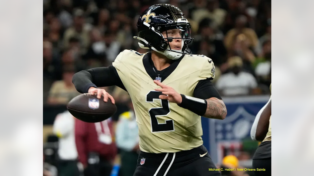
Michael C. Hebert / New Orleans Saints
But I digress. The point of this whole article actually was to come out in support of some of baseball’s more creative uniform creations. On every forum, every social media platform, the City Connect rollouts get absolutely trashed. I think it’s justified in some cases, but I also think a lot of the uniforms get quite a bit of thought and effort put into them. And in a few cases, they turn out to be my favorite uniforms out of the whole teams’ uni lineup. If there’s anything I actually don’t like about the uniforms, it’s the sponsorship patches each team wears on the sleeve. I’m not here to get into all that so we’ll save that for another time.
So, it got me thinking…which city connects are my favorite? Well, as I went through, I could only pick out 6 or so that I actually loved. The rest fell somewhere in between the “OK to Hate It” categories. And for the ones that ended up being my favorites, I still liked some of the respective teams’ plain old home or road uniforms better. So, I decided to go through each team’s uniform lineup and pick out my favorite uniform for each team and then rank the uniforms 1-30 against each other. I also found out I have a type (there are a lot of pinstripes and light/powder blues on this list). Something to keep in mind is that the hat and jersey are both taken into account here. I’m a big hat guy (so far, I have 14 out of 30 MLB teams represented on my wall, with two more on the way), so the whole setup has to look right.
Shout out to the website Uniform Lineup. Their site was extremely helpful when it came to getting the full picture of every team’s uniforms.
Some of these will admittedly rub some readers the wrong way. If you’ve got something to say about it, let me know on any of my socials (X, Reddit, Instagram, Bluesky, etc. - the links are everywhere so I trust you’ll be able to find me). So, here we go:
30. Houston Astros - Alternate Orange Uniform with Alternate Orange Cap
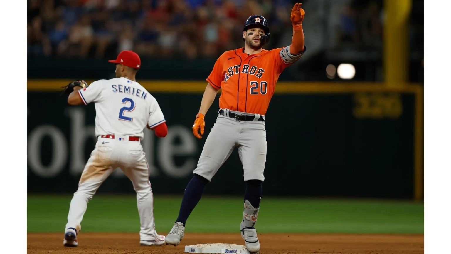
July 3: *GO 'HEAD! Tim Heitman/Getty Images
I had a really hard time picking my favorite Astros uniform. None of the combinations really do it for me. I didn’t like either City Connect. In all honesty, I don’t even really like the Craig Biggio-style from the 2000’s either. Sorry Astros fans.
29. St. Louis Cardinals - Home Uniform

July 13: Oh yeah! Dilip Vishwanat/Getty Images
I realize this is a classic and the Cardinals are one of the oldest franchises in baseball. But I’m not a big fan of heavy red.
28. Tampa Bay Rays - City Connect
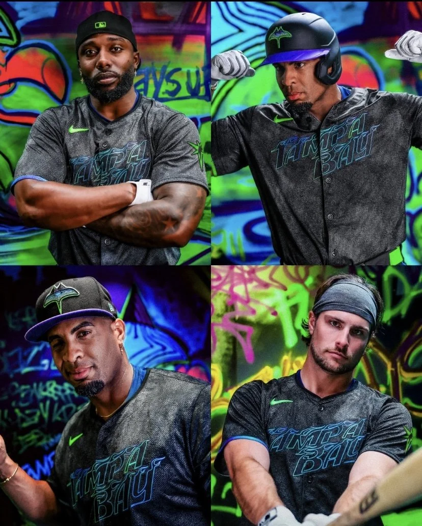
latinosports.com
The Rays have one of the most boring uniforms in baseball. I’m not really sure I even like the City Connect; it’s just the fact that it’s not a blue uniform that says “Rays” with a boring “TB” hat.
27. Detroit Tigers - Home Uniform
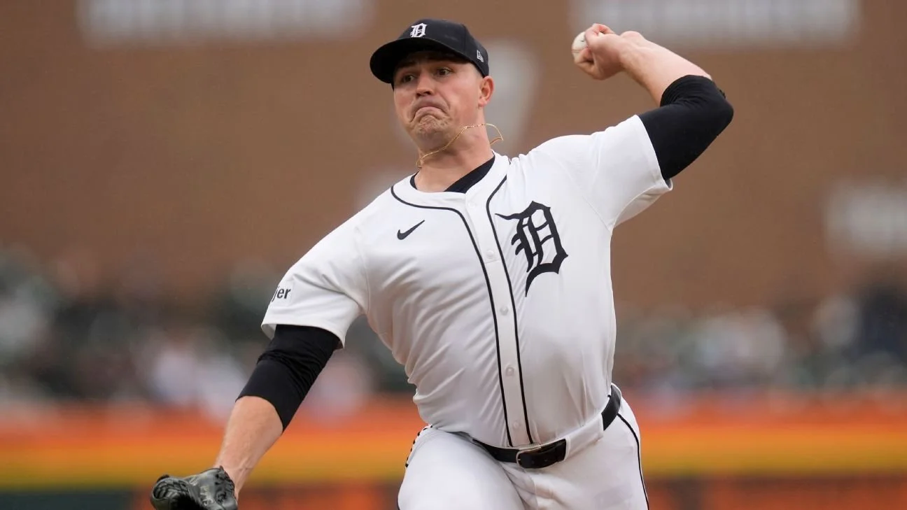
ESPN.com
For the Tigers, I think the plain jerseys work. I think the “Motor City” City Connects, although I understand the meaning, are still not pleasant to look at. If I had to pick one, I'd stick with the plain-old white uniform with the “D” on the left breast and on the hat.
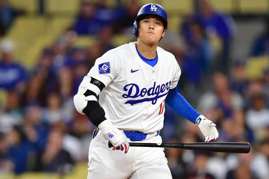
26. Los Angeles Dodgers - Home Uniform
flashscore.com
Another classic jersey. I’m okay with the look of it and the tradition behind it. It’s simple, it’s iconic, but it’s not for me. Neither City Connect was good either.
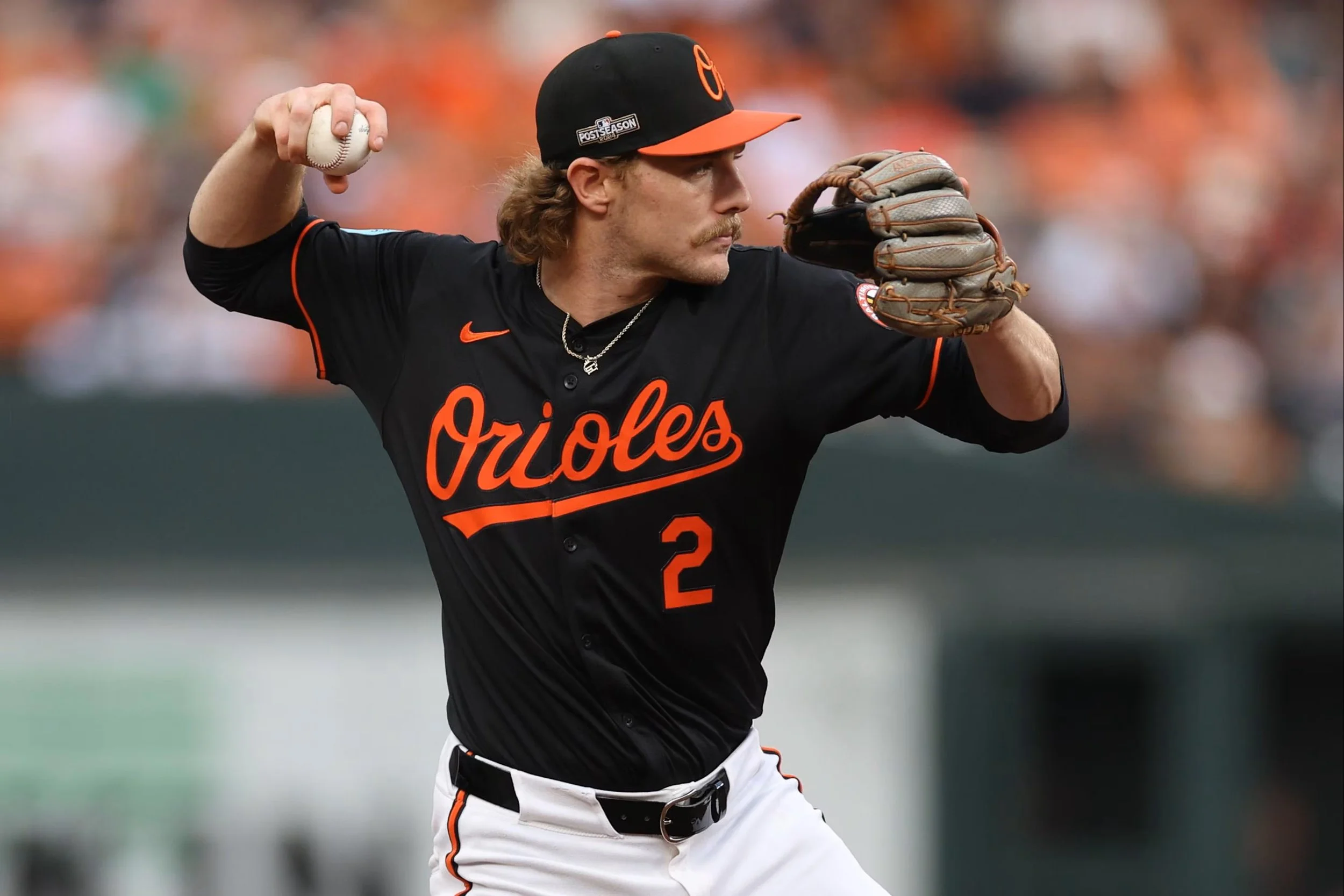
25. Baltimore Orioles - Alternate Black Uniform
bleacherreport.com
I like these jerseys for the players they have on the team. I think it’s perfect for making their young-looking players look like they’ve got some edge and maturity, vs. a bright orange uniform looking like they’re a bunch of little league players who try to wear as many bright, neon colors as possible.
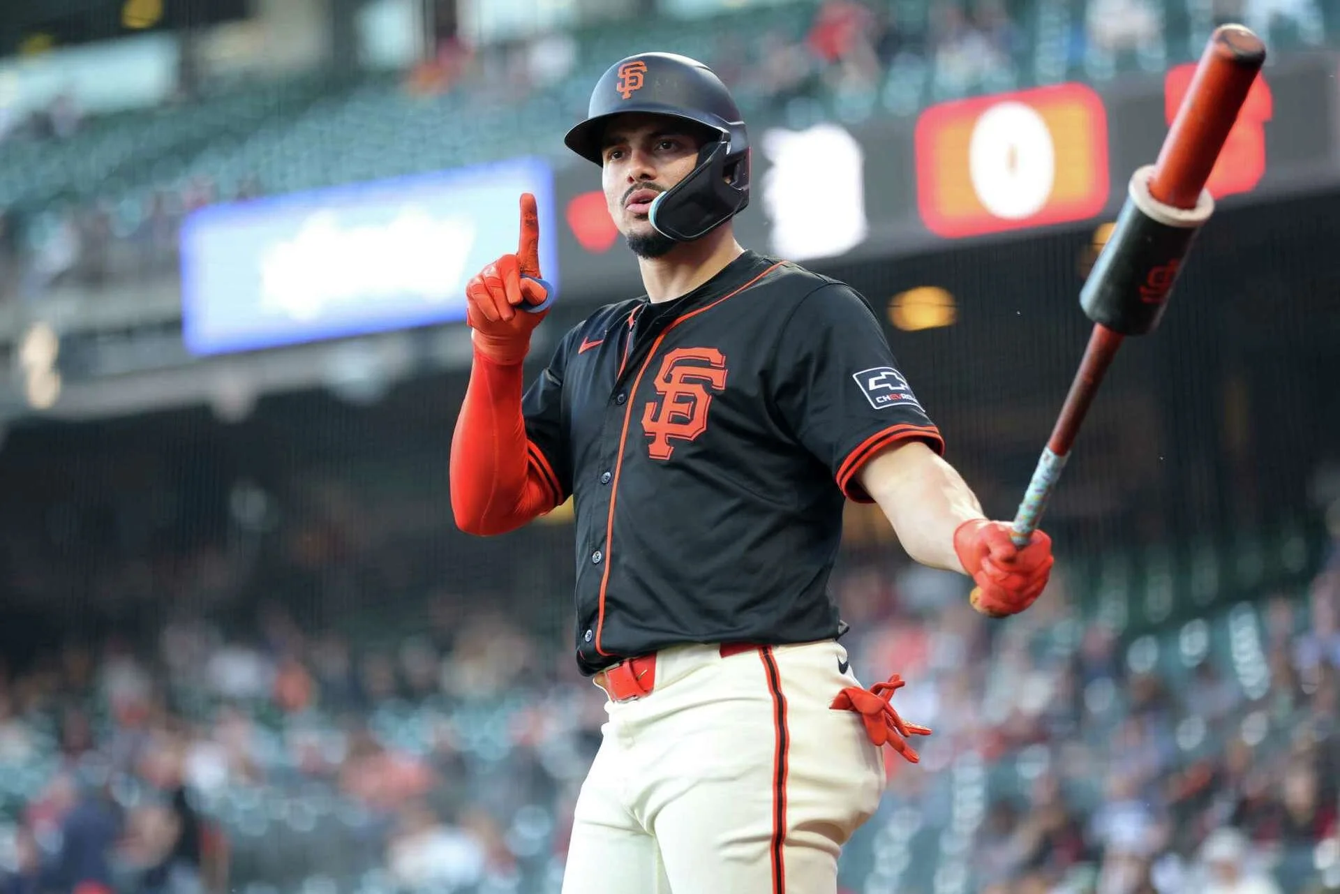
24. San Francisco Giants - Alternate Black
sfchronicle.com
If the Giants had a hat that I liked, this would be higher. Willy Adames hitting 3-run bombs in the black unis goes hard. The old City Connect was average, and the new one is well below average.
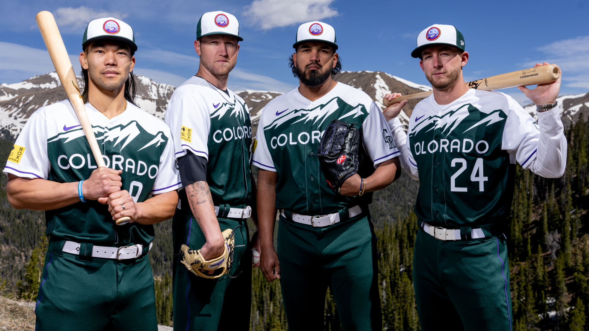
23. Colorado Rockies - (2025) City Connect

denversports.com
I’m actually bummed they replaced their green City Connects (pictured below). I realize it was modeled after a license plate, but I thought they stood out, bringing a nice color of green to a league of reds and blues. The hat also looked like you’d find it on anyone hiking a mountain in CO. The new ones are fine. I’ll take any hat that isn’t the awful black with the purple “CR”.
kdvr.com
22. Washington Nationals - (2025) City Connect

espn.com
I was also sad to see their former City Connects go. I liked the cherry blossoms. The new hat I think looks great, and the road map on the uniform is an interesting accent (on top of a great blue color), but I do not like the “DC” stylization on the chest.
21. Minnesota Twins - Alternate Home

minnpost.com
I’m a big fan of the cream color. I like that the “TC” on the hat is one color and not a red and white combination on their traditional home uniform. My favorite hat of theirs is actually the “M” with the North Star above it, but I realize it doesn’t play well if the jersey says “Twin Cities” and the hat says “M”.
20. Kansas City Royals - Alternate Home
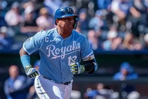
deadspin.com
I really like their powder blues. Picturing Big Salvy hitting a single off the wall with a bat that looks like a toothpick in his hands, while rocking these jerseys, should be a nationally televised event more often.
19. Toronto Blue Jays - Alternate Blue
Although I lean more towards the powder/light blues, I think the royal blue alternates represent the Blue Jays best. I think it fits well with the aura of the team. Blue Jays are one of my favorite birds. I’m always excited to see one outside my house.
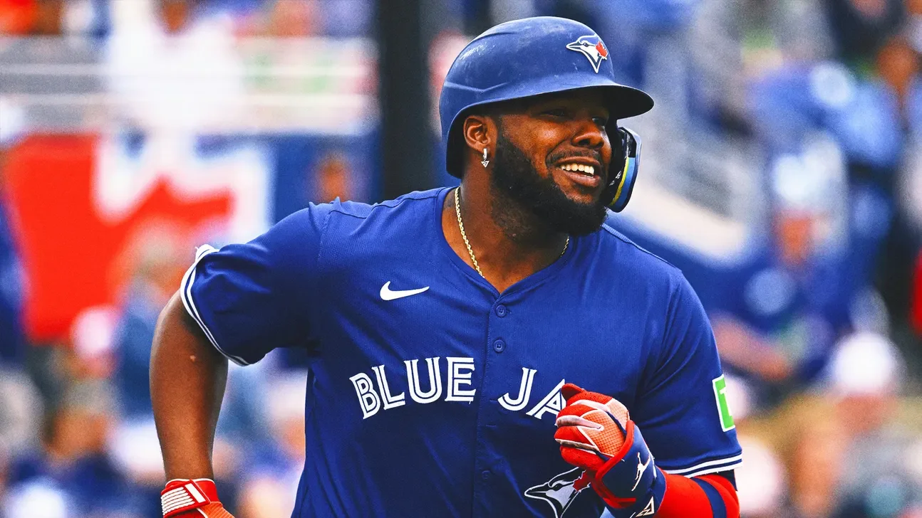
foxsports.com
18. Texas Rangers - Alternate Home
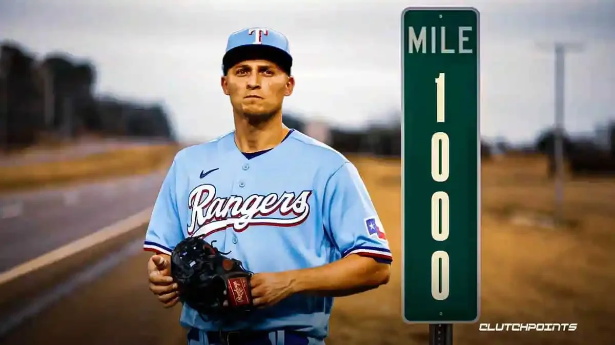
clutchpoints.com
When I think of these uniforms, I picture the weirdly high camera angle from the Texas ballpark, and Corey Seager calmly hitting a ball 120mph. The hat is the real winner here. It’s the reason I have these powder blues above the Royals’ powder blues.
17. New York Mets - City Connect
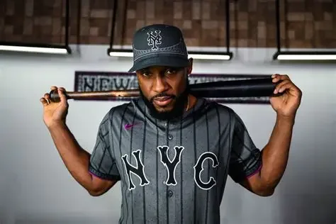
amazinavenue.com
This one caught a lot of heat. It gives off some Yankees’ vibes. But that might be why I like it. I do like the blue and orange look of the Mets. But something about the hat’s design with the bridge doesn’t allow me to stop looking at it. It’s the hat that wins, the rest passes.
16. Pittsburgh Pirates - City Connect

news.sportslogos.net
It’s the hat that does it for me here. I like the inversion of the traditional Pirates’ colors on the hat. The jersey is fine. I don’t mind the yellow actually, I’m just not sure I like the “PGH” across the front. Those aren’t exactly the top three letters that come to mind when I’m trying to shorthand “Pittsburgh”.
15. Atlanta Braves - City Connect

theatlantavoice.com
I love this one because of the heavy white with blue contrast to it. I like the “The A” on the chest with the number on the opposite side. I think it does a great job of accenting those colors with that sharp red as well. A real classic uniform that I hope sticks around.
14. Chicago White Sox - Alternate Black
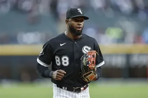
sportminded.co.uk
Although the White Sox are an organizational disaster, they actually have great uniforms. And no, I’m not talking about the weird Bulls/White Sox red and black crossover product of a Jerry Reinsdorf wet dream. I like the traditional black. If they would have kept their “Southside” City Connect unis with the black and white pinstripes (pictured below), they might have been Top 5.

newsweek.com
13. Miami Marlins - Alternate Home
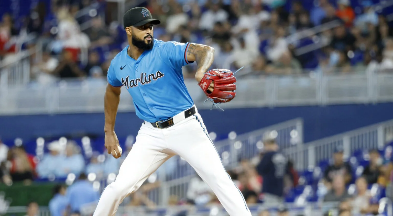
totalprosports.com
I really like the light blue here. This is how I like to picture the Marlins…going back and forth with the Nationals for 9 innings in front of a stadium full of 200 fans. But the jerseys are great. My honorable mention is the now-retired City Connect hat (only the hat, not the strawberry red jersey).
12. The (Sacramento) Athletics - Alternate #2

mlb.com
These yellow jerseys actually look really good. I love the “A’s” on the jersey, the elephant on the sleeve, and the cap is iconic. I’m not sure how it will all change once the team officially moves to Vegas. They haven’t exactly kept me in the loop.
11. Cincinnati Reds - City Connect

uni-watch.com
Much like the Pirates, the hat is what seals it for me here. I’m a sucker for a rope hat. I know this isn’t a rope hat, but it looks like one with the way the red stripe breaks up the black. Elly De La Cruz looks absolutely sick in these uniforms
10. Chicago Cubs - Alternate #2
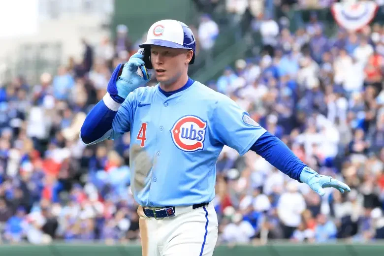
heavy.com
The first time I saw these jerseys this year, I fell in love. If I didn’t already have a Cubs hat, I would have bought one of these immediately. But it’s actually the jersey I like more than the hat. The powder blue color with the stylization and the font of the lettering looks great. The positioning of the number is also very unique, but it works.
9. Cleveland Guardians - City Connect
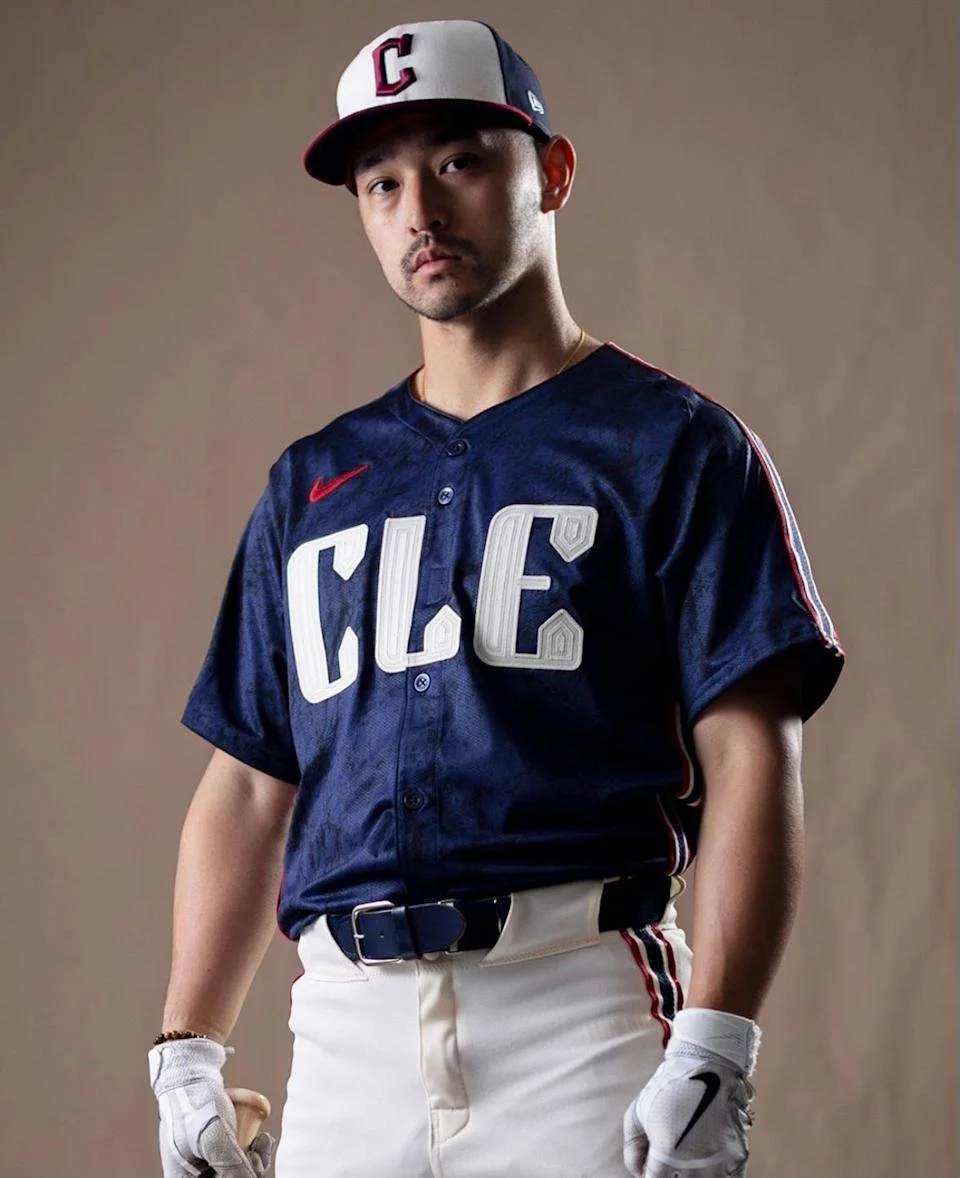
ca.sports.yahoo.com
When I first saw this last year, I thought it was boring. But I saw it in action, and I couldn’t stop looking at the hat and the contrasting white lettering on the jersey on top of that rich blue. I think the majority of groupthinkers on the internet are underwhelmed by this, but I think it’s so simple and clean that it looks great. Also, the Guardians regular lineup of uniforms is very bland, so this is a nice look.
8. Los Angeles Angels - City Connect
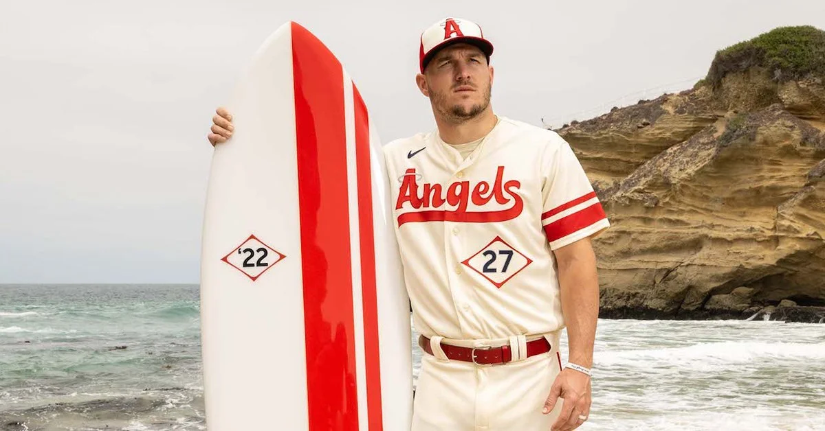
modernnoteriety.com
I love the cream color of these uniforms, and I like that the number is on the front and tucked into a diamond. I think the hat looks great and the font on the front looks smooth. It’s a shame they play so late at night (I’m in central time) and aren’t really that enjoyable to watch, because I really like these uniforms.
7. Milwaukee Brewers - Alternate Home
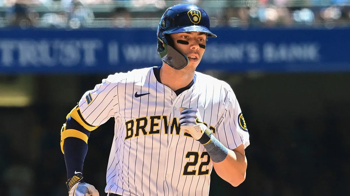
clutchpoints.com
I’m biased because this is my team, but the “MB” logo is one of, if not the most creative logos in baseball. The white pinstripe uniforms look so clean. I also love the City Connects, but I had to put the white pinstripes on top.
6. Seattle Mariners - City Connect
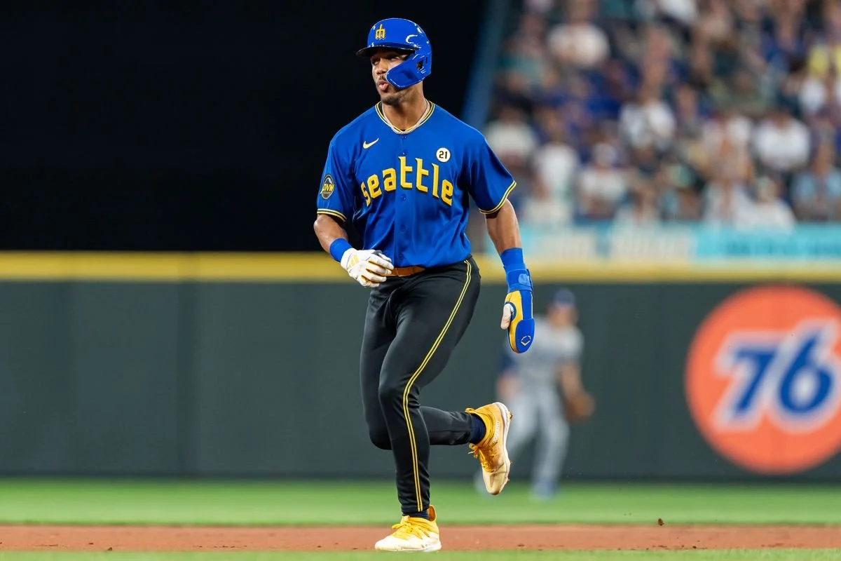
lookoutlanding.com
Going off of the Brewers’ creativity, I love the way the Mariners used the trident to make an “M” on the hat. I really like the way the blue and yellow contrast each other. This is my third-favorite City Connect uniform in the league right now (yes, there are two more on the list).
5. New York Yankees - Home Uniform
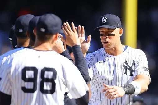
themirror.com
I mean, what other uniform of theirs could I really pick? This uniform is baseball. I grew up a Yankees’ hater, as I watched them snag all of my favorite players and then make them cut their hair and shave their faces. But as I get older I start to appreciate and admire their adherence to their history and traditions. At first, I was happy they lifted their hair and beard policy, but I find myself wishing they eventually reinstate it, as it looks weird with Carlos Rodon’s long hair and beard, sweating all over the mound.
4. Philadelphia Phillies - Home Uniform

theathletic.com
This was a tough one because I couldn’t choose between this one or the throwback powder blue and maroon home unis (I ruled out the weird City Connect one pretty quickly). It could just be recency bias, but the home Phillies’ uniform represents October baseball, and I look forward to watching guys like Schwarber, Harper, Turner, Realmuto, Suarez, Sanchez, etc. rocking the cherry pinstripes in the postseason.
3. Arizona Diamondbacks - (2025) City Connect
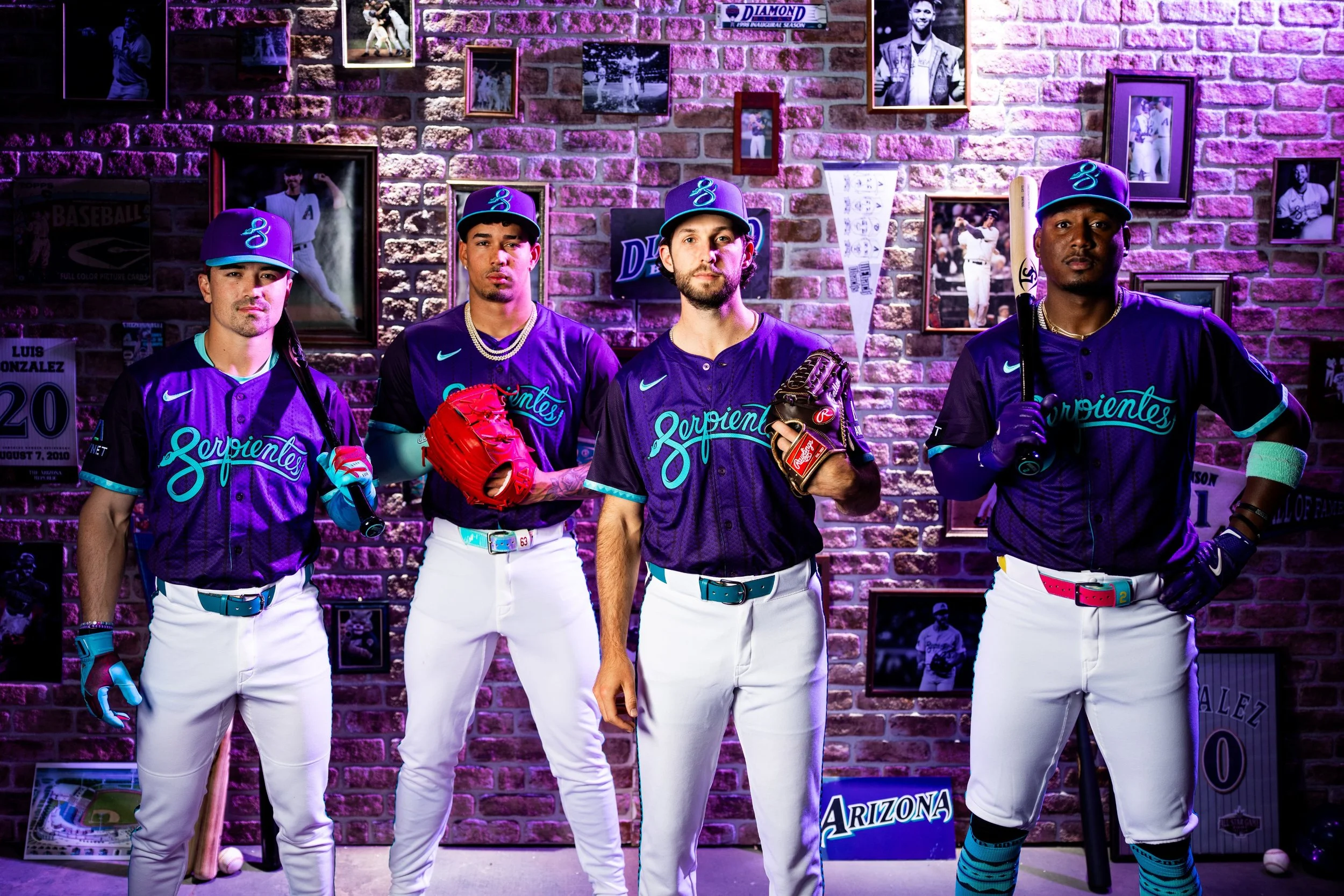
sports360az.com
These colors are perfect. It reminds me of a Wildberry Poptart (criminally underrated flavor), and although no one seems to care on X, I feel it’s necessary to point that out. The snake on the hat looks awesome, and I love that they stuck with “Serpientes” on the front of the jersey. I already have a Diamondbacks hat, but this might be the first team (other than my Brewers) I buy a second hat for. Side note: I showed these to my wife, and she did NOT like them. That should give you an indication of how off my tastes are.
2. Boston Red Sox - (2025) City Connect
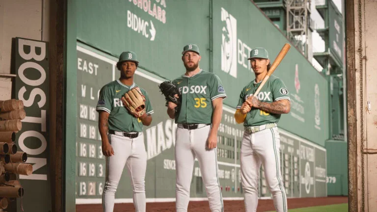
boston.com
Not the yellow ones. These green jerseys are awesome. I love that they leaned into the “Green Monster” lore and put the same white lettering and font on the jersey. I like the yellow numbers on the front, and an underrated thing I like is the encircled “B” on the sleeve. I have one of these hats on the way to my house to add to the collection.
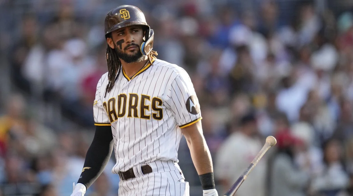
San Diego Padres - Home Uniform
si.com
The Padres have one of the best uniform lineups in baseball. I don’t love the Miami Vice City Connects, but the rest of their uniforms are awesome. The white pinstripes look so clean and the brown and yellow play off each other really well. Their gray road uniforms look great, their alternate brown and yellow uniforms look great as well, and their digital camo uniforms are one of the most unique in baseball.
Well…what did I get wrong?